7 Elements
7.2 Working with the logo
There are many reasons why you would want to have a logo on your slides. Quarto has a logo option for exactly that.
format:
  revealjs:
    logo: logo.svg
The logo is placed in the lower right-hand corner, and it is repeated on every slide.
logo option.If you want to modify the logo beyond this, we will have to use SCSS to do it.
One thing to know before you start writing rules against it. Quarto styles the logo in a stylesheet that is loaded after your theme, so a rule with the same specificity as Quarto’s will lose. The fix is !important, which is why it shows up throughout this section.
7.2.1 Moving it around
The default position comes from bottom and right. We can specify the position with top, left, bottom, and right. To move the logo somewhere else, set the two properties you want, and reset the two you don’t want to auto.
.reveal .slide-logo {
  top: 12px !important;
  left: 16px !important;
  bottom: auto !important;
  right: auto !important;
}top and left and resetting bottom and right to auto.Notice that the logo now sits right on top of the slide title. If you wanted to keep the logo there, you will need to modify the styling of the headers and body to not take up space there.
7.2.2 Sizing it
The size is set with max-height rather than height, since height is already used to scale the logo against the slide. Give the height and let the width follow along.
.reveal .slide-logo {
  max-height: 5rem !important;
  bottom: 20px !important;
  right: 20px !important;
}
Bumping the height means the logo takes up more room in the corner, so it is worth revisiting the offsets at the same time.
max-height, with the corner offsets adjusted to match.Quarto shrinks the logo on narrow screens with a media query. Because we used !important our size wins there as well, which is what I want most of the time. If you would rather keep a smaller logo on small screens, repeat the rule inside @media screen and (max-width: 800px) with a smaller max-height.
7.2.3 Hiding it
One of the interesting things about the logo is that it isn’t tied to any one of the slides. It sits as its own element on top of the slide deck itself. This means that it is a little harder to modify it on a slide to slide basis. Not impossible, just harder.
A very common thing one might want is to be able to turn off the logo for specific slides. The following is the SCSS needed to make that happen.
.reveal:has(section.present.hide-logo) .slide-logo {
  display: none;
}
With that rule in your theme, adding {.hide-logo} to a slide heading removes the logo from that slide only.
## No logo here {.hide-logo}.hide-logo class to remove the logo, which returns on the following slide.7.2.4 A bigger logo on the title slide
The above code works for normal slides, but the title slide is different. If you want to modify it then we need to do something more. Instead of just hiding it we will instead show how we can move the whole logo around just for the title slide.
.reveal:has(section#title-slide.present) .slide-logo {
  max-height: 4rem !important;
  top: 12% !important;
  left: 50% !important;
  bottom: auto !important;
  right: auto !important;
  transform: translateX(-50%);
}7.2.5 Keeping it visible on dark and busy slides
Having the same logo on every single slide can be hard, since depending on the background it might blend in too well on some slides. We can fix that by creating a CSS class that specifies an alternative.
If you have a light version of the logo as a separate file, you can swap the image out with content. If the slide has {.dark} then the light logo will be used.
.reveal:has(section.present.dark) .slide-logo {
  content: url('../../../../../logo-light.svg');
}
The ../../../../../ is the same ugliness we ran into when embedding a font, and for the same reason. Paths are resolved against the generated stylesheet rather than against your .qmd file, so you may have to add or remove ../ for your folder structure. Getting the count wrong leaves you with a broken image icon instead of a logo.
content: url().If your logo is monochrome you don’t need a second file at all, invert() will do it.
.reveal:has(section.present.inverted) .slide-logo {
  filter: invert(1);
}
Neither approach helps on top of a photo, since there is no single color to fit in with. What works there is giving the logo its own plate to sit on.
.reveal:has(section.present.plate) .slide-logo {
  background-color: #fdf8f4;
  padding: 4px 10px;
  border-radius: 8px;
  box-sizing: content-box;
  filter: drop-shadow(0 2px 6px rgba(0, 0, 0, 0.4));
}
The box-sizing: content-box is there so the padding is added around the logo instead of eating into it, and the shadow lifts the plate off the image.
filter: invert(1) on a dark slide, and placed on a light rounded plate with a drop shadow on a slide with a background photo.Photo by Galen Crout on Unsplash
7.4 Showing quarto code
This one isn’t as much a slidecrafting tip, as it is a quarto tip! If you are showing how to do something in Quarto using Quarto you need this tip. In essence what we are working with are unexcuted blocks.
Adding a markdown cell around what you want to show. Important to use more ticks than any of the inside cells inside.
Using double curly brackets to indicate that the code block should not be executed. The following code when used in a quarto document will render as shown in the example
```` markdown
This is **Quarto** code

```{{python}}
1 + 1
```
````{{python}}), so the code block appears verbatim rather than being run.7.5 Changing plot backgrounds
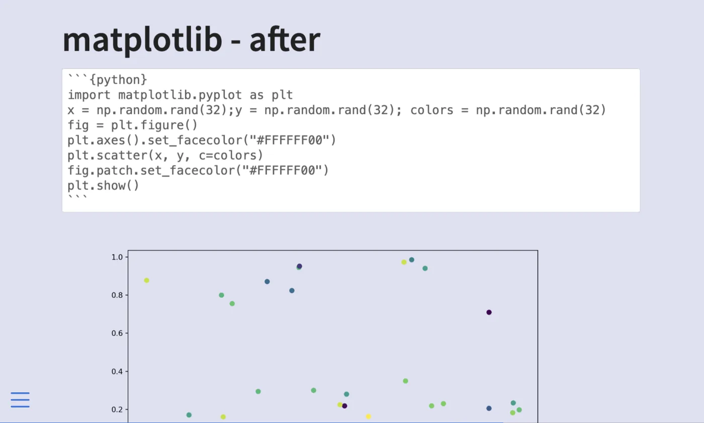
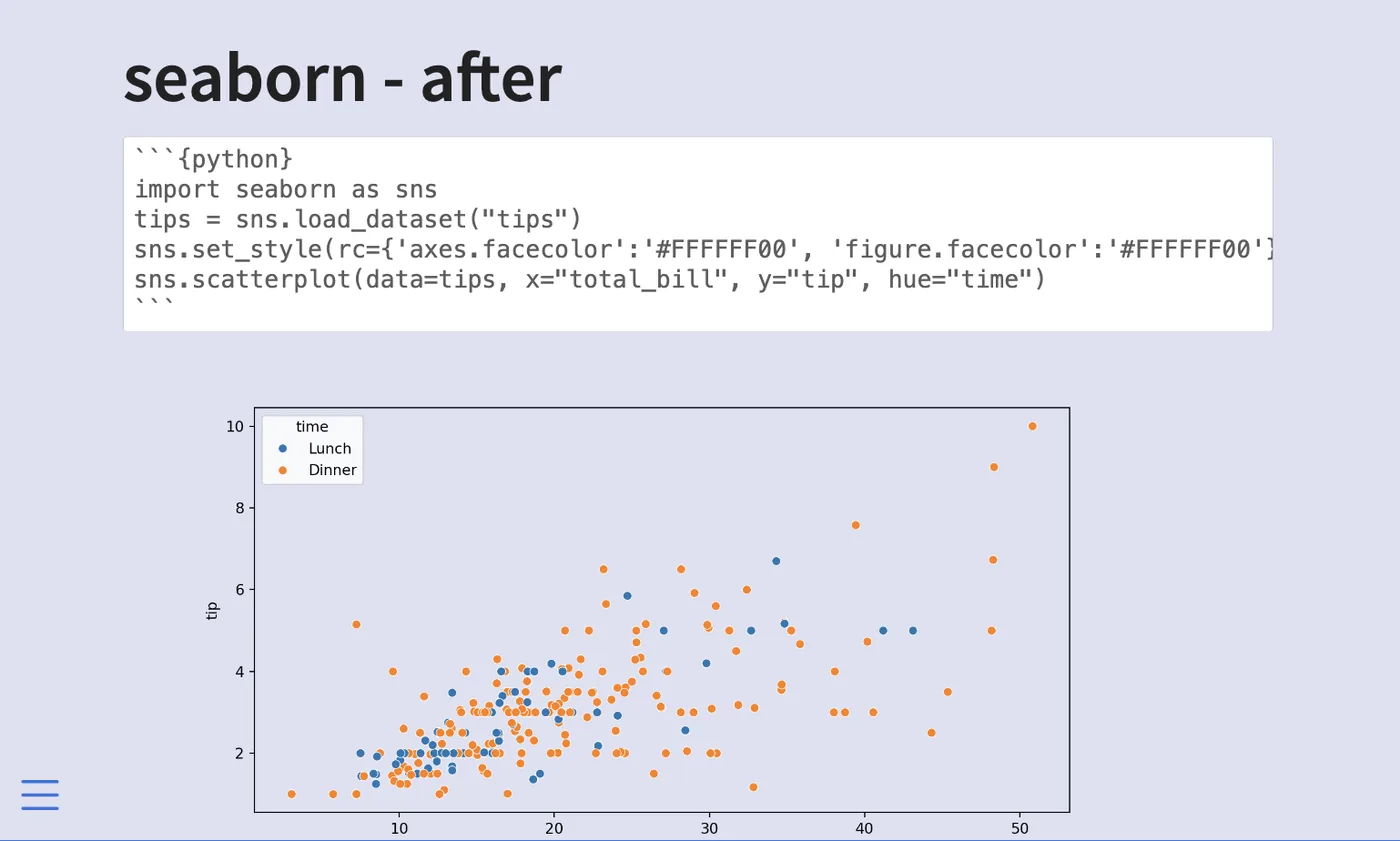
Plots and charts are useful in slides. Changing the background makes them fit in. This post will go over how to change the background of your plots to better match the slide background, in a handful of different libraries.
7.5.1 Why are we doing this?
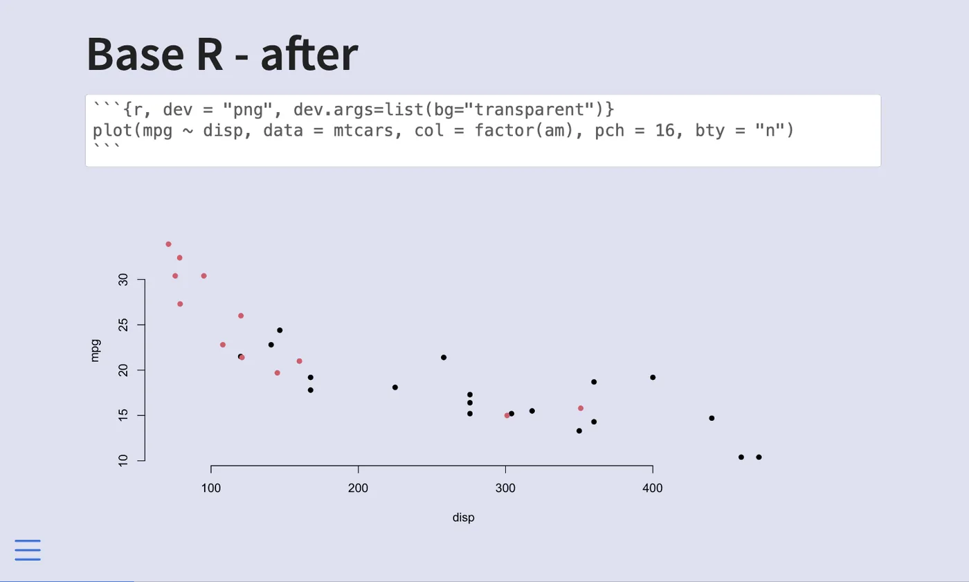
If you are styling your slides to change the background color, you will find that most plotting libraries default to using a white background color. If your background is non-white it will stick out like a sore thumb. I find that changing the background color to something transparent #FFFFFF00 is the easiest course of action.
Why make the background transparent instead of making it match the background?
It is simply easier that way. There is only one color we need to set and it is #FFFFFF00. This works even if the slide background color is different from slide to slide, or if the background is a non-solid color.
7.5.2 base R
we don’t have to make any changes to the R code, we can supply the chunk options dev and dev.args for the chunk to "png" and list(bg="transparent") respectively and you are good. The chunk will look like this.
```{r, dev = "png", dev.args=list(bg="transparent")}
plot(mpg ~ disp, data = mtcars, col = factor(am), pch = 16, bty = "n")
```
You can also change the options globally using the following options in the yaml.
knitr:
  opts_chunk:
    dev: png
    dev.args: { bg: "transparent" }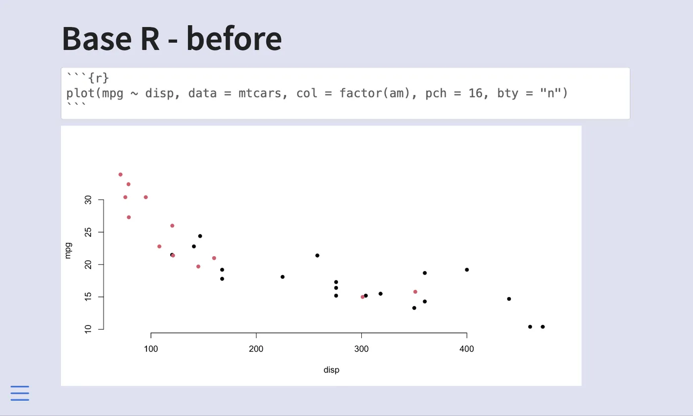
7.5.3 ggplot2
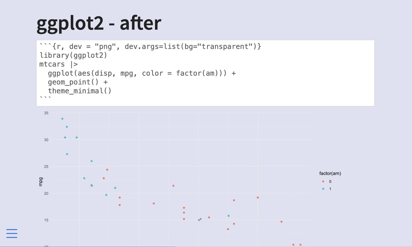
ggplot2 are handled the same way as base R plotting, so we don’t have to make any changes to the R code, we can supply the chunk options dev and dev.args for the chunk to "png" and list(bg="transparent") respectively and you are good. The chunk will look like this.
```{r, dev = "png", dev.args=list(bg="transparent")}
library(ggplot2)
mtcars |>
  ggplot(aes(disp, mpg, color = factor(am))) +
  geom_point() +
  theme_minimal()
```
You can also change the options globally using the following options in the yaml.
knitr:
  opts_chunk:
    dev: png
    dev.args: { bg: "transparent" }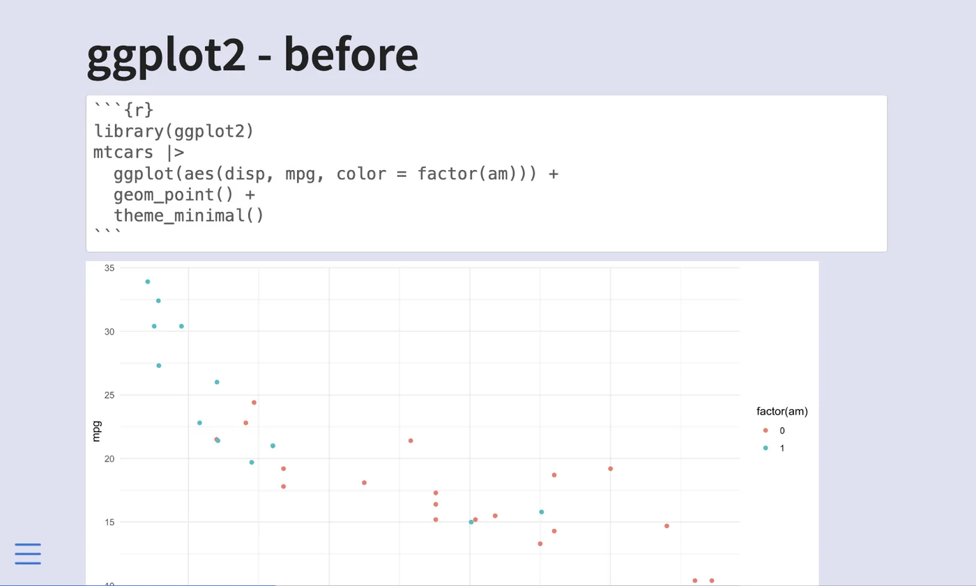
7.5.4 matplotlib
With matplotlib, we need to set the background color twice, once for the plotting area, and once for the area outside the plotting area.
fig = plt.figure()
# outside plotting area
plt.axes().set_facecolor("#FFFFFF00")

# your plot
plt.scatter(x, y, c=colors)

# inside plotting area
fig.patch.set_facecolor("#FFFFFF00")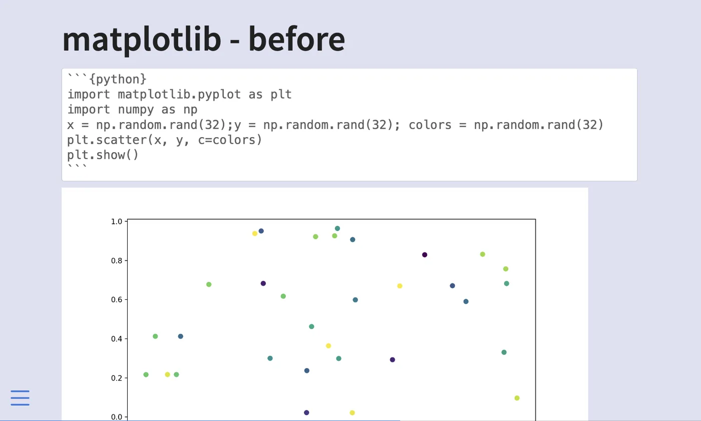
7.5.5 seaborn
For seaborn, we also set it twice, both of them in set_style()
sns.set_style(rc={'axes.facecolor':'#FFFFFF00',
                  'figure.facecolor':'#FFFFFF00'})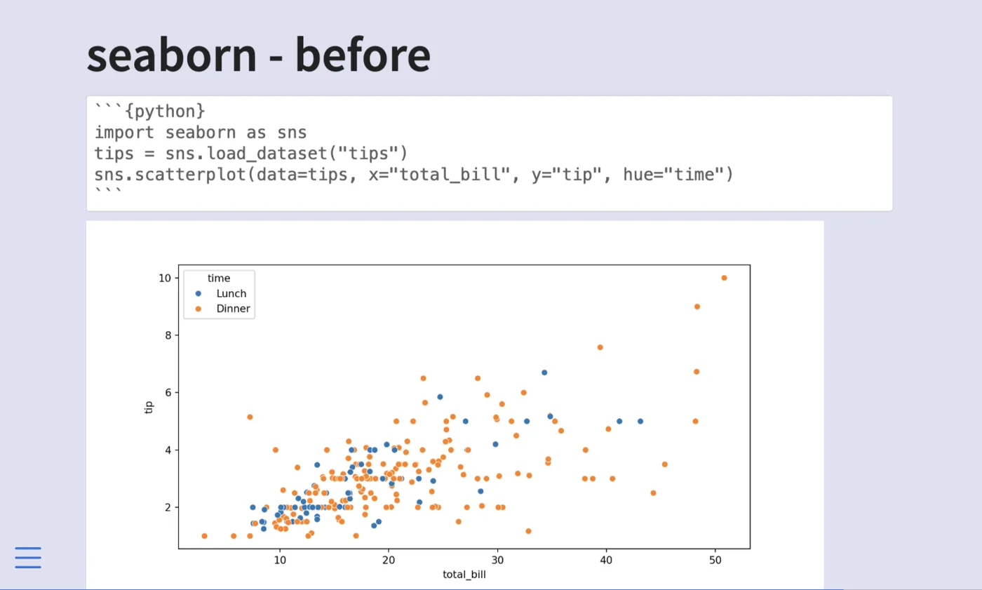
7.5.6 Source Document
The above was generated with this document.
7.6 Plot sizing
Plots and charts are useful in slides. But we need to make sure they are sized correctly to be as effective as possible.
7.6.1 auto-stretch option
Revealjs slides default to having the option auto-stretch: true, this ensures that figures always fit inside the slide. You can turn it off globally like this.
format:
  revealjs:
    auto-stretch: false
or on a slide-by-slide basis by adding the .nostretch class to the slide.
## Slide Title {.nostretch}We see how they affect sizing in the following slides first with the default, and second with .nostretch.
auto-stretch: true (default): the figure is automatically scaled down to fit within the slide boundaries..nostretch class: the figure is shown at its natural size, potentially overflowing the slide.By themselves, they look pretty similar. One occasion where you really notice the difference is when there are other elements on the slide. auto-stretch makes sure the image fits by making the image smaller as seen below.
auto-stretch enabled: image is shrunk to fit alongside the other content..nostretch: image renders at full natural size and may overlap or push other content off the slide.7.6.2 Sizing Options
When sizing plots we need to remember that we have to deal with two kinds of sizes. First is the size of the actual file on disk, this is controlled using out-width and out-height. Next is how big the image is supposed to be in the document, which is controlled using fig-width, fig-height, and/or fig-asp. Lastly, you can control the location using fig-align and the resolution using fig-dpi.
All of these numbers will change depending on whether you have a title or other elements on your slides, what fonts you use, and the aspect ratio of the slides themselves.
7.6.2.1 out-width, out-height
Setting these options affects the size of the resulting image on disk. If they are set smaller than usual, we get an image that doesn’t take up the whole screen.
```{r}
#| out-width: 6in
#| out-height: 3.5in
```out-width: 6in, out-height: 3.5in: the saved image file is small, resulting in a figure that does not fill the slide.out-width/out-height example, shown alongside a default-sized chart.I don’t find myself using these options much as I tend to want images that take up most of the space, but they are useful to know.
7.6.3 fig-width, fig-height
I end up using fig-width and fig-height the most out of the options shown in this blog post. I find that the default values are too high, making the text on the plot too small for the viewer to see. Especially for an in-person audience.
Below is the same chart 4 times with different value pairs for fig-width and fig-height. Notice how the default values appear to be around fig-width: 9 and fig-height: 5.
fig-width: 9, fig-height: 5 (Reveal.js defaults): text labels on the chart appear small and may be hard to read for an audience.fig-width and fig-height: larger text relative to the plot area, improving readability for live audiences.fig-width/fig-height combination showing how the ratio between dimensions affects text and element sizes on the chart.fig-width/fig-height variant in the comparison series, demonstrating that smaller values produce larger, more legible chart text.All of the above figures have roughly the same aspect ratios, but if you want others you just specify different values. Like this square chart below.
fig-width and fig-height values, demonstrating how aspect ratio is controlled independently of the slide dimensions.7.6.4 fig-asp
You might have noticed that the ratios shown in the last section weren’t identical. Because unless you deal with 1-2 or 1-1 ratios you are going to get decimals very fast. And you have to recalculate small things over and over again. This is why fig-asp is amazing. Simply determine the aspect ratio between the height and width, set that as the fig-asp and then you just have to set one of fig-height or fig-width. Is it too small? increase fig-height and keep fig-asp the same. is it too big? decrease fig-height and keep fig-asp the same.
fig-asp to fix the aspect ratio: changing fig-height scales the chart proportionally without needing to update both dimensions.fig-asp ratio at a different fig-height, showing how the chart scales up or down while maintaining consistent proportions.7.6.5 fig-align
Unless your chart fits fully inside the slide then it tends to be left aligned, you can change that with fig-align, setting it to left, center or right.
fig-align: left: the figure is positioned against the left edge of the slide content area.fig-align: center: the figure is centered horizontally on the slide.fig-align: right: the figure is positioned against the right edge of the slide content area.7.6.6 fig-dpi
Lastly, something you might need to worry about is the Dots Per Inch (DPI) specified by fig-dpi. This is a measure of resolution in your chart. If you see your chart becoming a little blurry, increase the dpi until it isn’t anymore. Note that dpi will result in larger file sizes, so only change if you have to.
fig-dpi: text and lines are crisp and sharp, at the cost of a larger file size.7.6.7 Make work with columns
even if you set the option globally, you will have to make slide-by-slide adjustments, such as with charts in .columns. Below is one example of how we can modify the fig-asp to make it look decent in a column layout.
fig-asp adjusted to fit the narrower column width, preventing the figure from overflowing its column.7.6.8 Source Document
The above was generated with this document.